24Flow Screen Components
This section describes a number of generic 24Flow screen components that have been designed to be used in conjunction with the Team Cockpit. They are amongst others being leveraged in the Time Tracking component, which is described separately in this documentation.
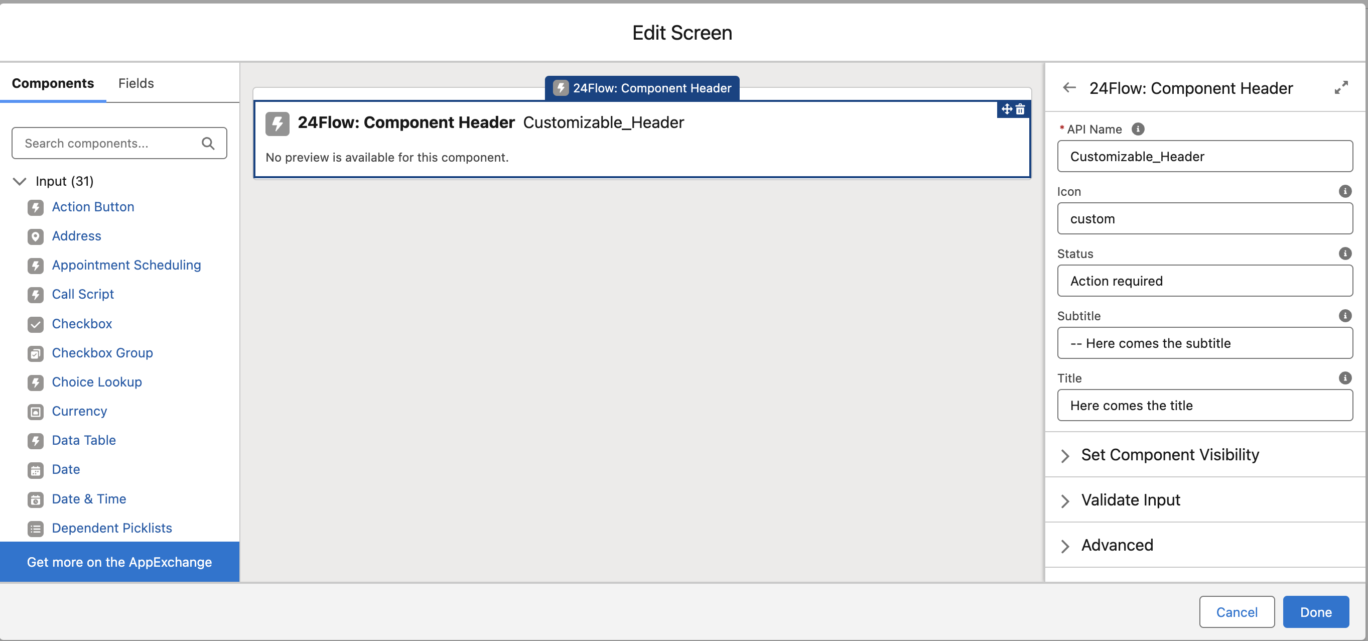
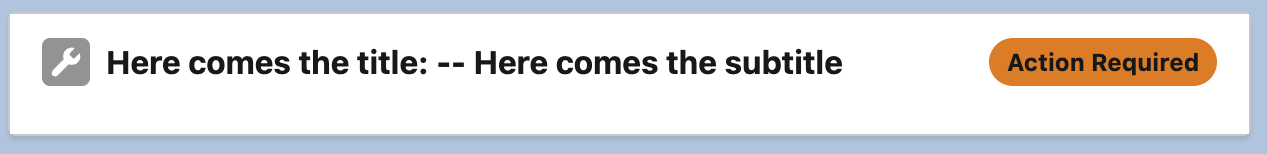
24Flow: Component Header
A customizable header to provide key information.
Icon: A customizable icon. Use standard or custom icons from Salesforce Lightning Design System Icons.
Status: Displays the status or stage of e.g. a time entry. Examples include "Action Required," "Inactive," and "Active."
Subtitle: Additional information displayed after the title.
Title: The main title shown on the header.
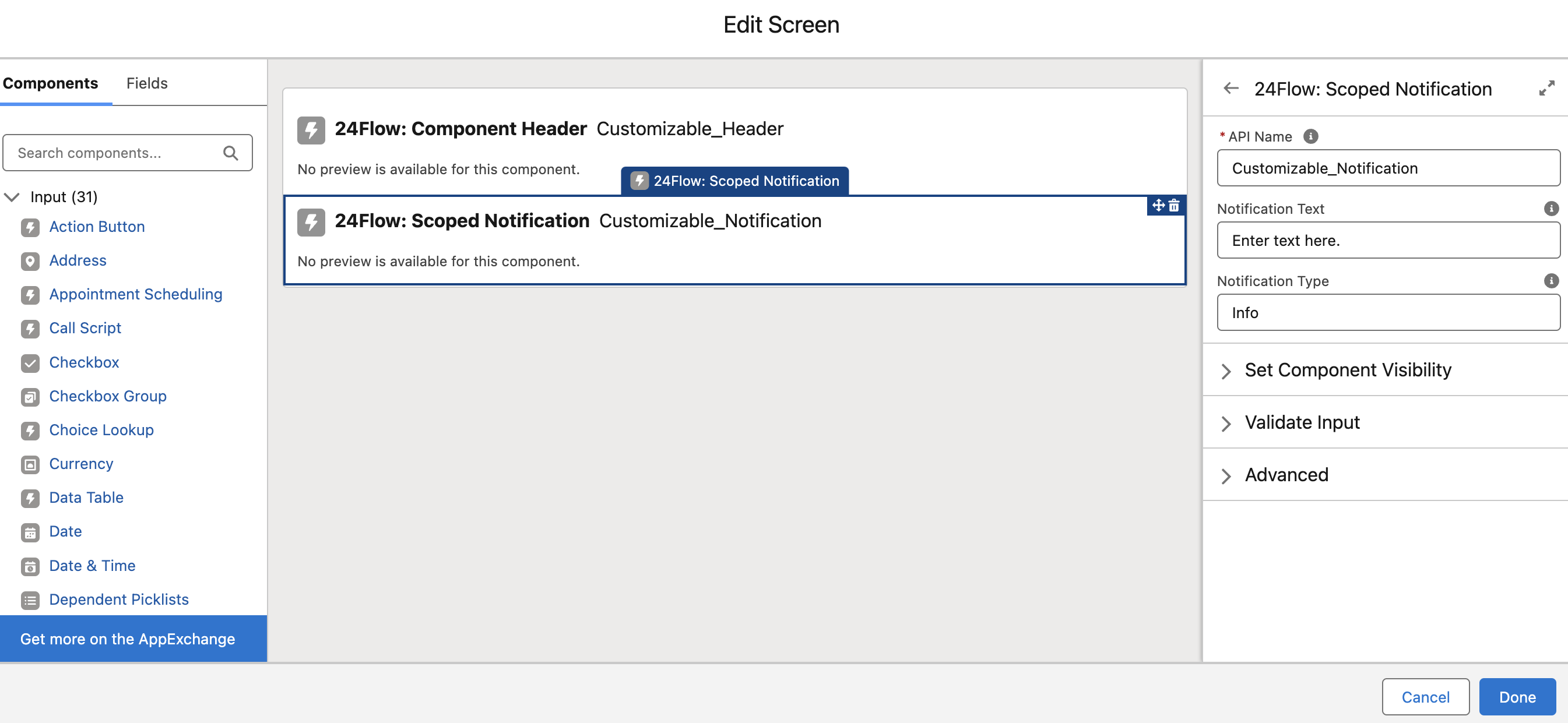
24Flow: Scoped Notification
A component designed to display notifications of a specific type.
Notification Text: The message to be displayed in the notification.
Notification Type: Specifies the type of notification: INFO, SUCCESS, WARNING, or ERROR.
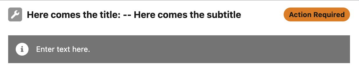
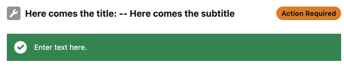
Combined component header and scoped notification.
Each type features a unique visual representation to suit the message. For example, changing the type to "SUCCESS" displays a distinct icon and styling.
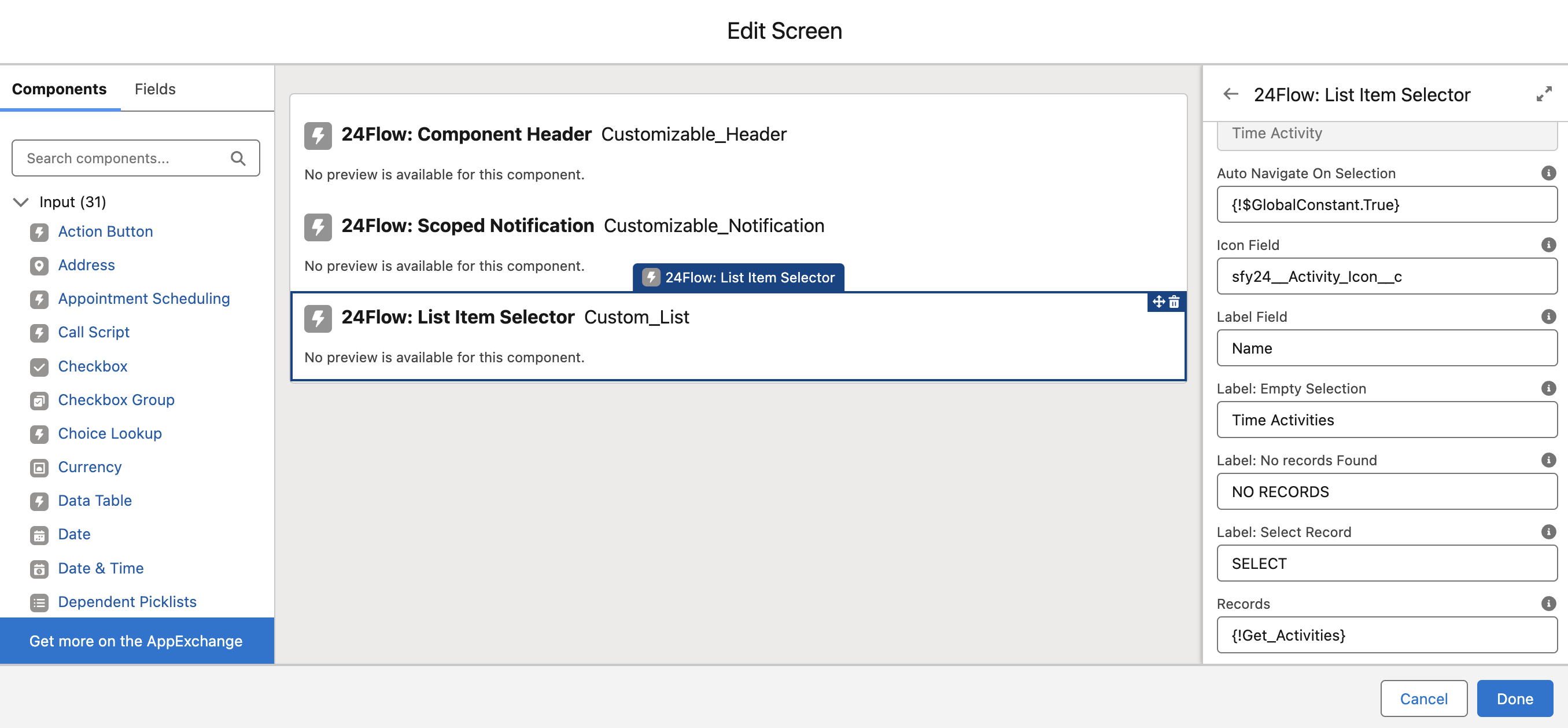
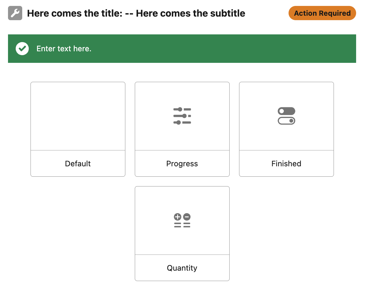
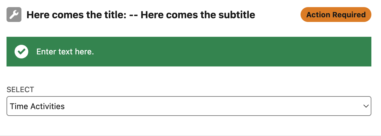
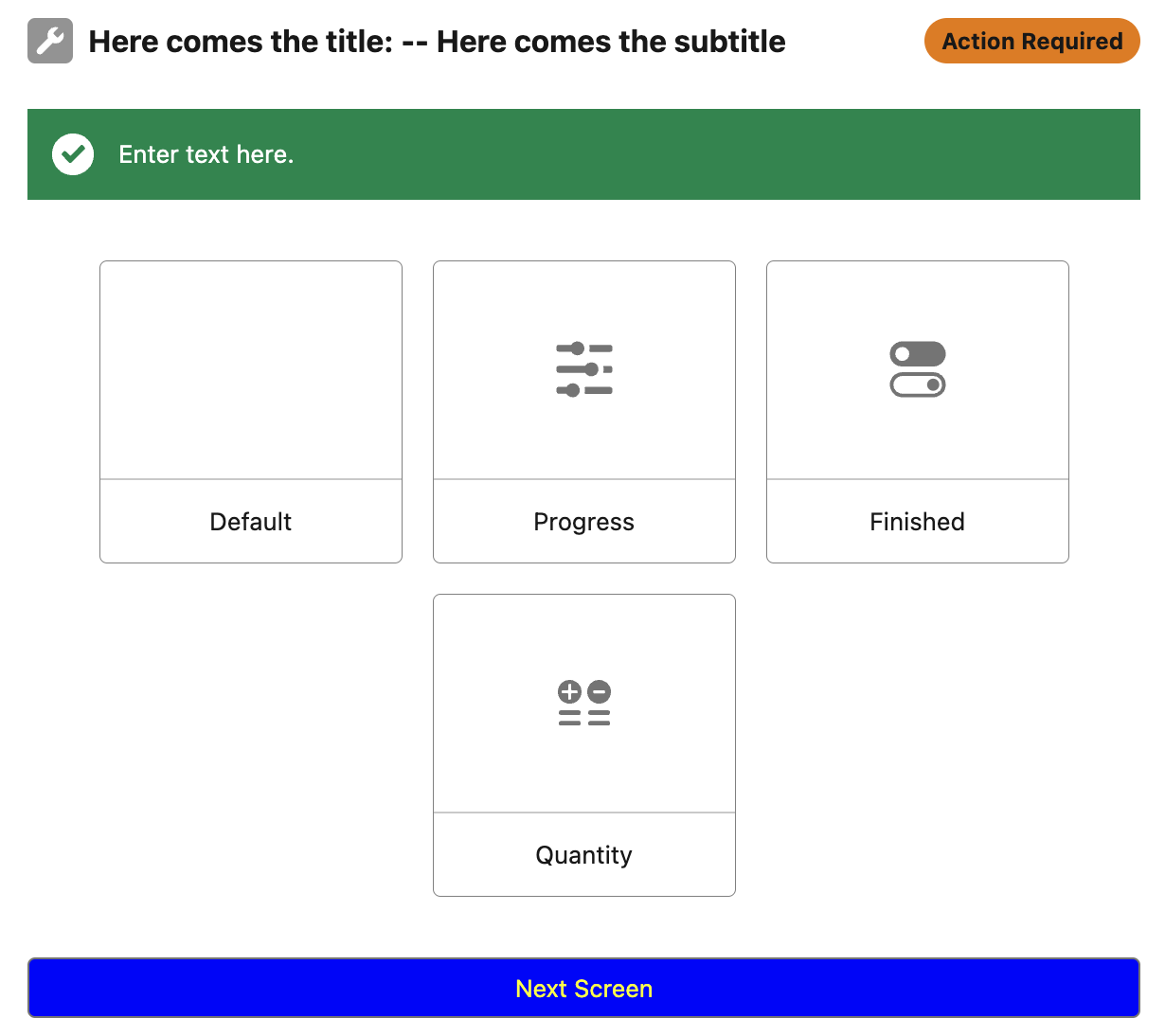
24Flow: List Item Selector
A component that displays a collection of records in either a card or list view, with the option to store the selected record in a variable.
Object: The object type for the list of records being passed.
Auto Navigate on Selection: Determines whether to navigate automatically upon record selection or wait for another action.
Icon Field: The API name of the field that determines the icon for a given record.
Label Field: The API name of the field that is portrayed on the item (In this example the label field = ‘Name’, and the ‘Name’ of the time activities are ‘Default’, ‘Quantity’, ‘Finished’ and ‘Progress’.
Label: Empty Selection: Text shown when no selection has been made and Show Card View is disabled.
Label: No Records Found: Text displayed when no records are available.
Label: Select Record: Text shown when no record has been selected.
Records: The list of records used to populate the component.
Show Card View: Toggles between card view and list view for displaying records.
The ‘Show Card View’ is set to true:
The ‘Show Card View’ is set to false :
24Flow: Button
A customizable button for triggering actions.
Action: Predefined action names by Salesforce (e.g., 'NEXT' for navigating to the next screen or 'FINISH' to complete the screen flow).
Button Color: CSS class or color configuration for the button's appearance.
Button Label: The text displayed on the button.
Button Size: Size configuration for the button (e.g., small, medium, large).
Label Color: Configures the color of the text on the button.
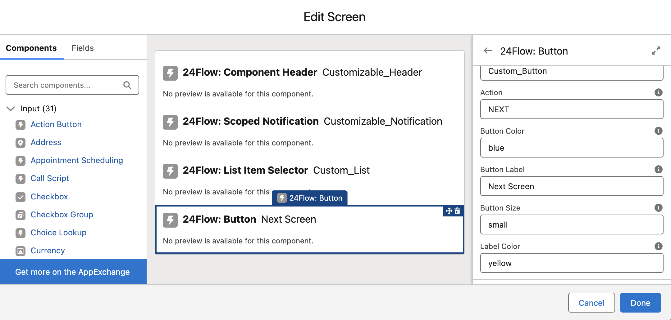
Pressing 'Next Screen' advances the flow to the following screen.
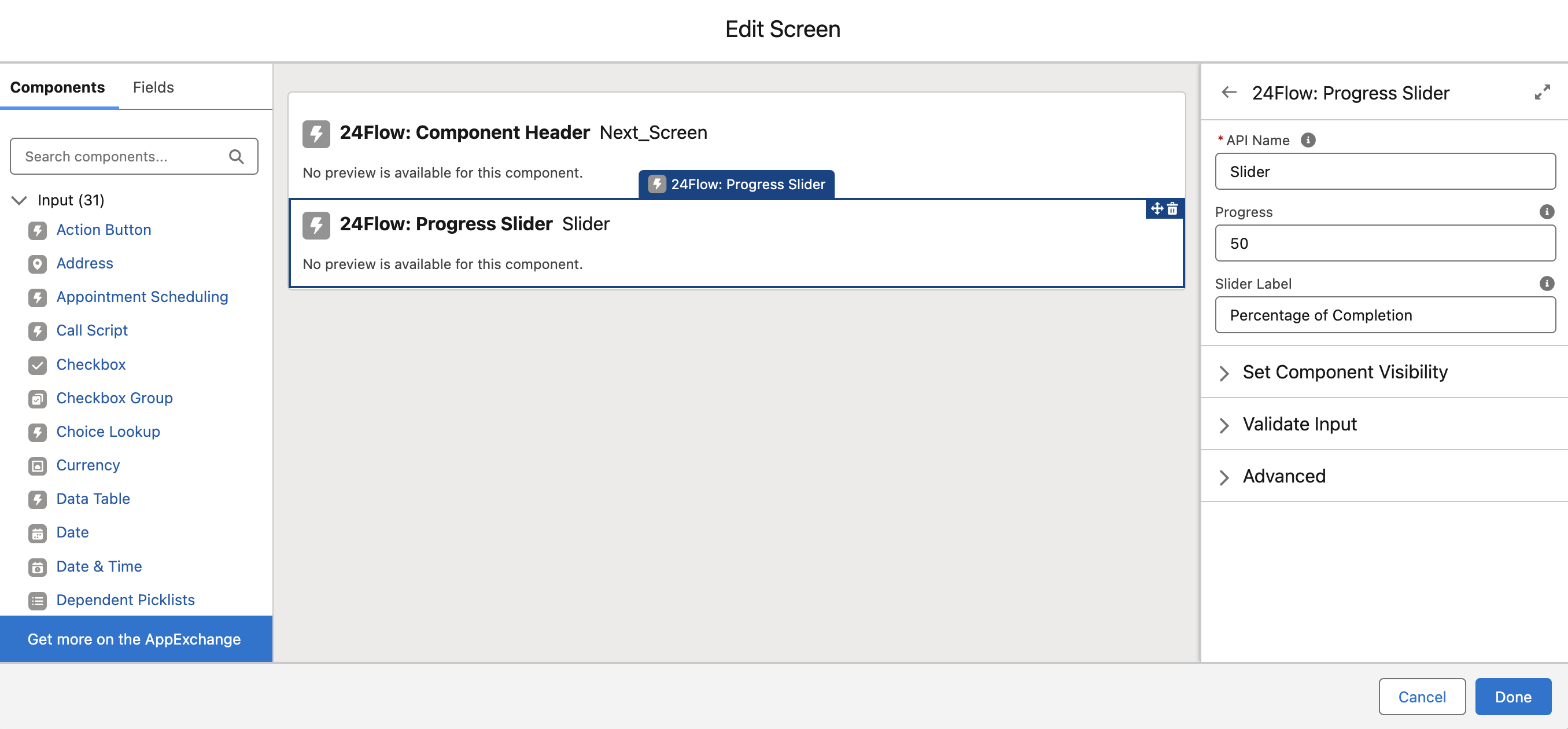
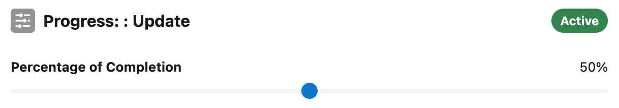
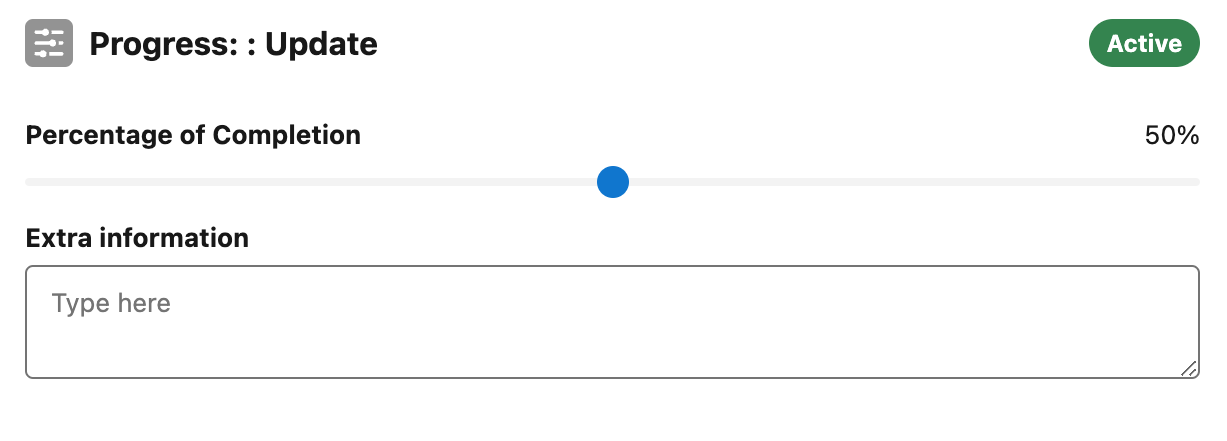
24Flow: Progress Slider
A slider component designed to measure and display progress.
Progress: The percentage of progress selected by the user.
Slider Label: The label displayed above the progress slider.
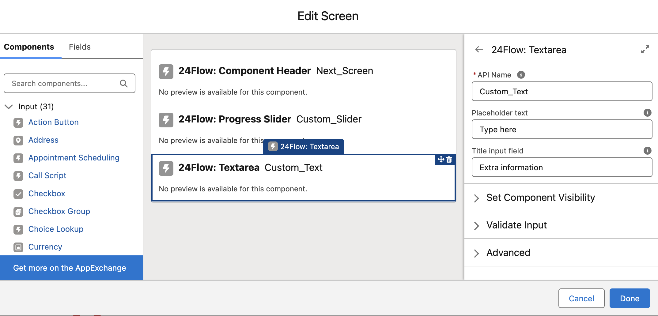
24Flow: Text Area
A component for text input.
Placeholder Text: Text displayed when the input field is empty.
Title Input Field: The label for the input field.
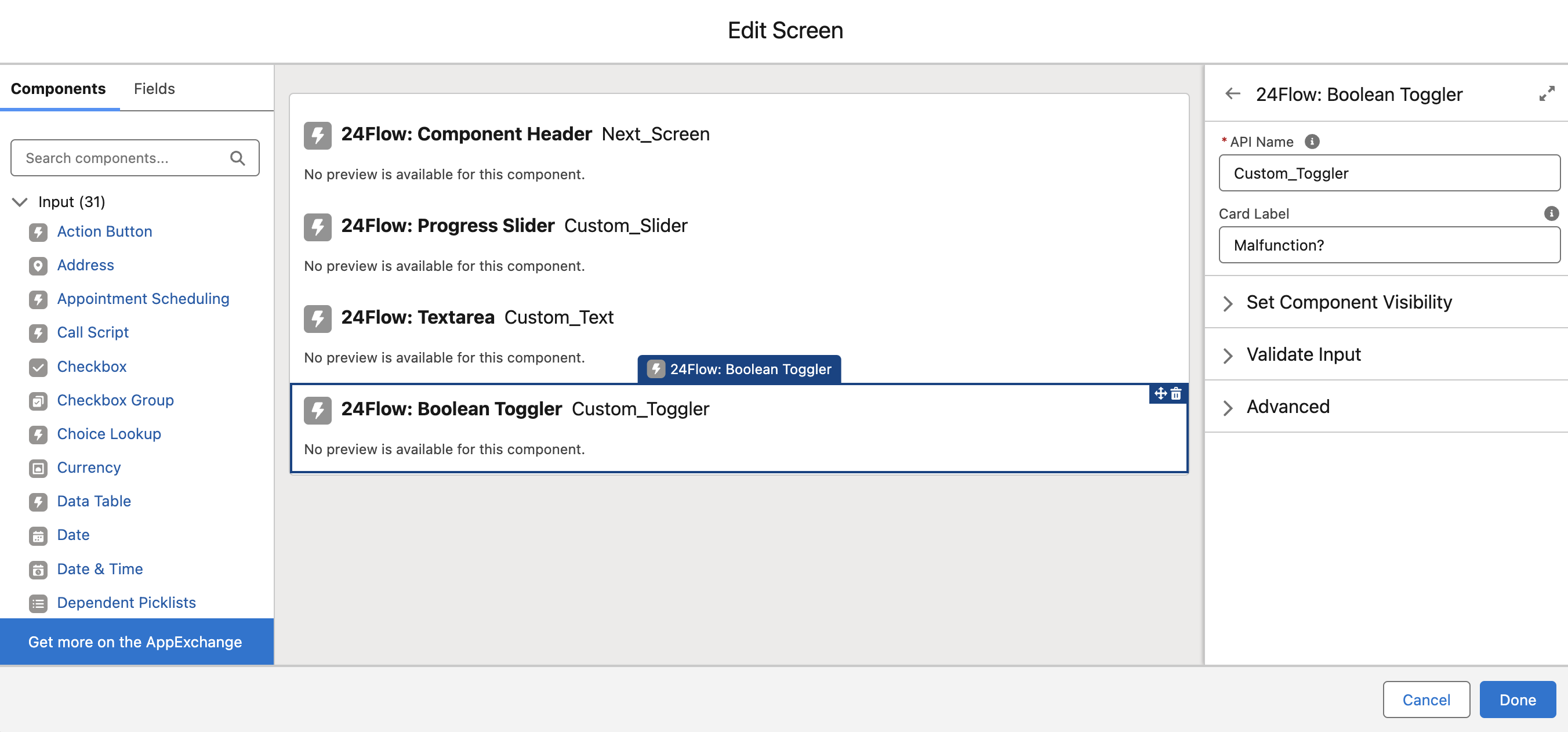
24Flow: Boolean Toggler
A toggle component presented as a card for selecting true/false, on/off, finished/cancelled, … options.
Card Label: The label displayed above the selection card.
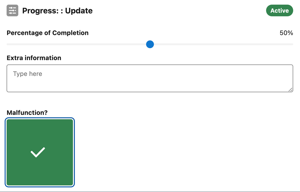
Checked
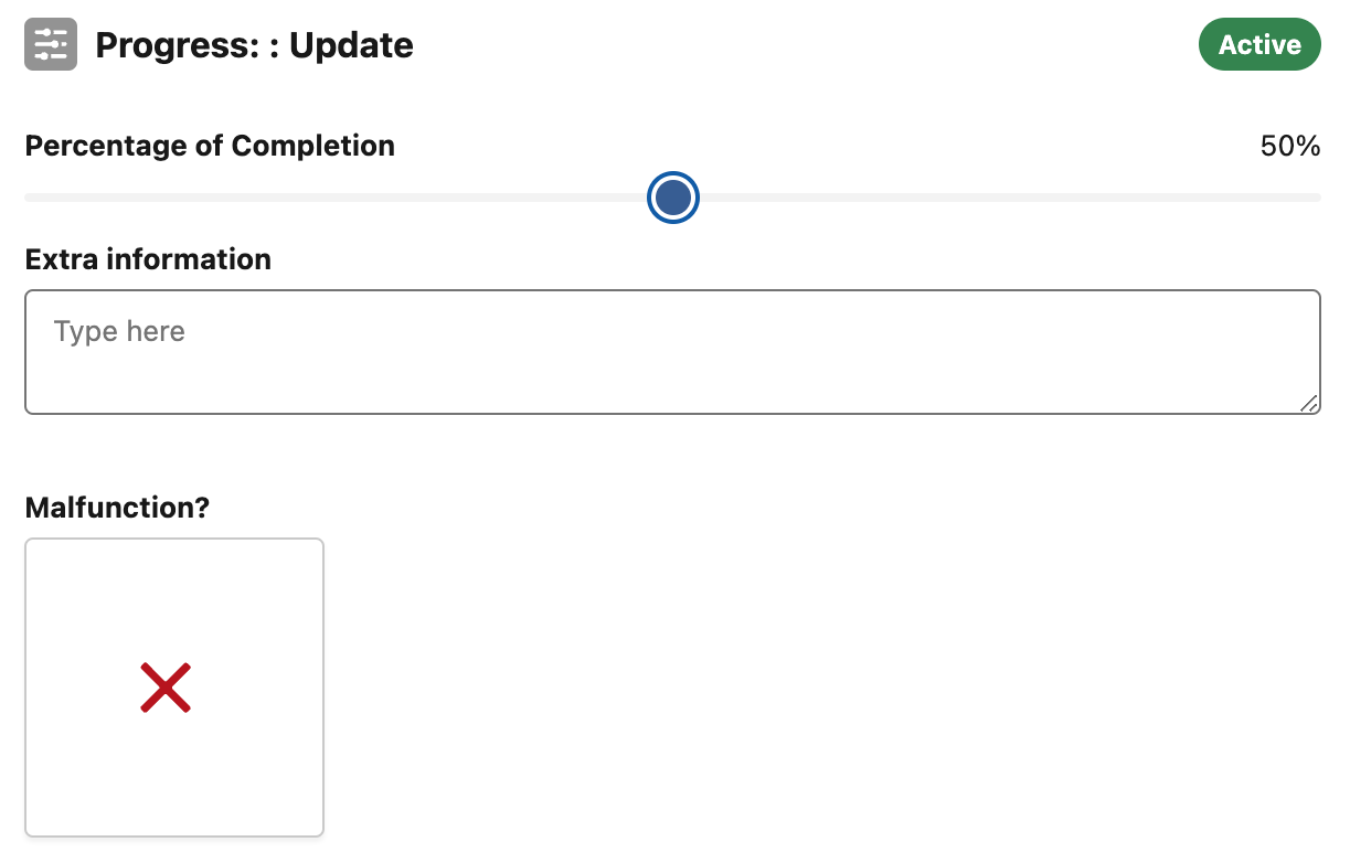
Unchecked
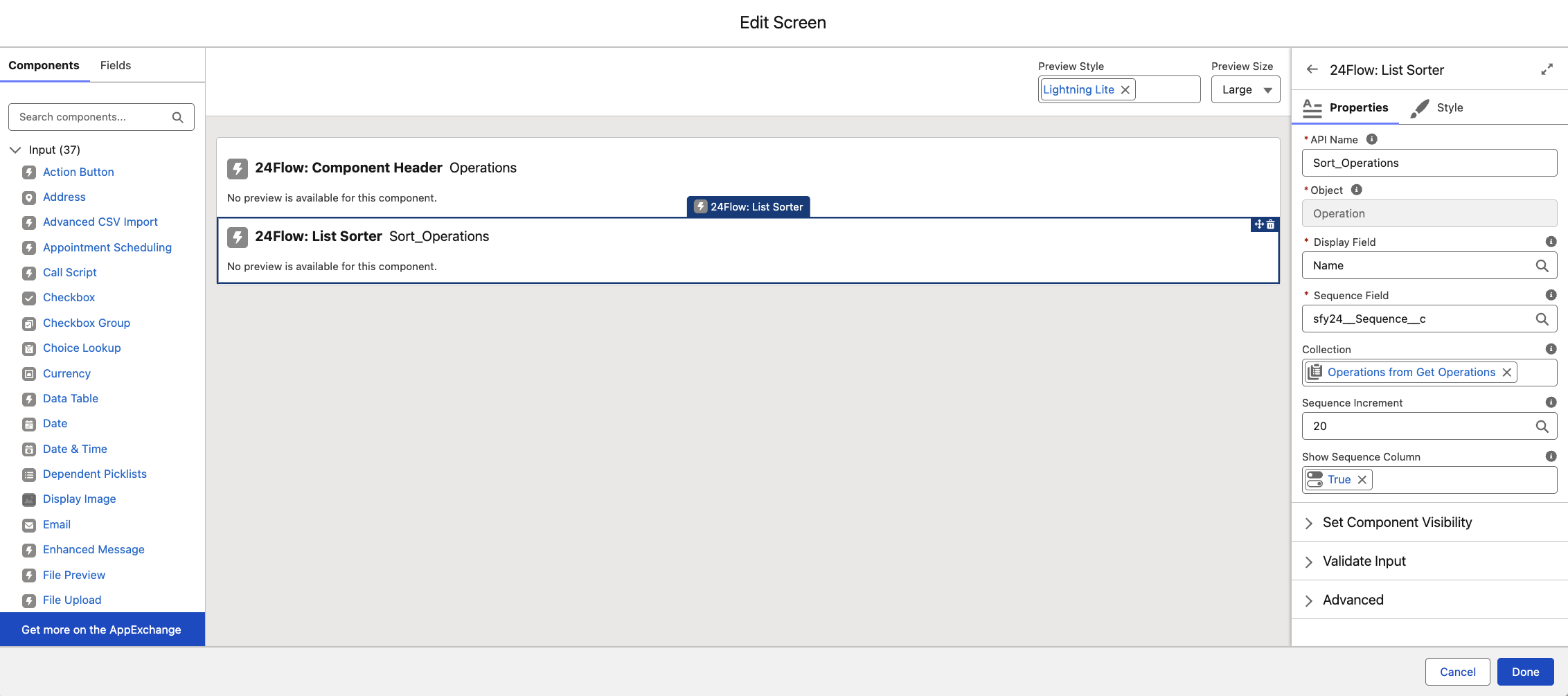
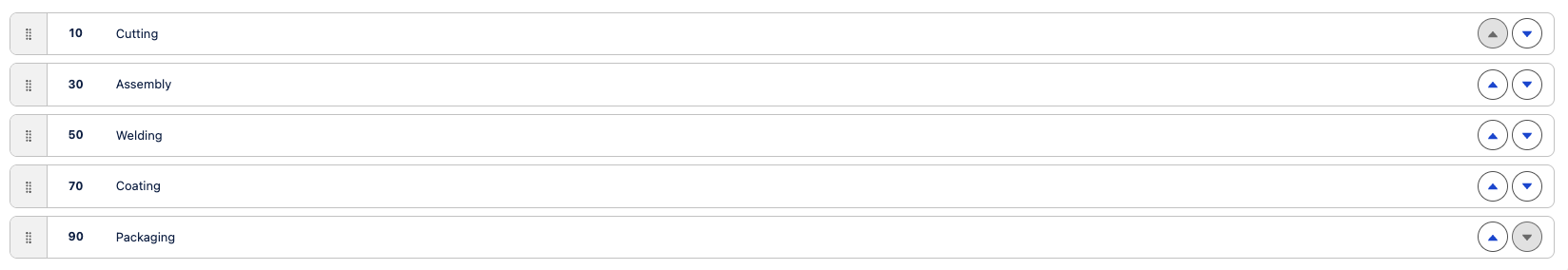
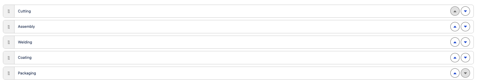
24Flow: List Sorter
Enables reordering records via drag-and-drop or arrow controls.
Object: The type of object in the collection.
Display Field: The label shown on the card.
Sequence Field: The field defining order.
Collection: The records displayed.
Sequence Increment: Sequence value between items, calculated if empty.
Show Sequence Column: Option to hide sequence numbers.